Responsive Web Design
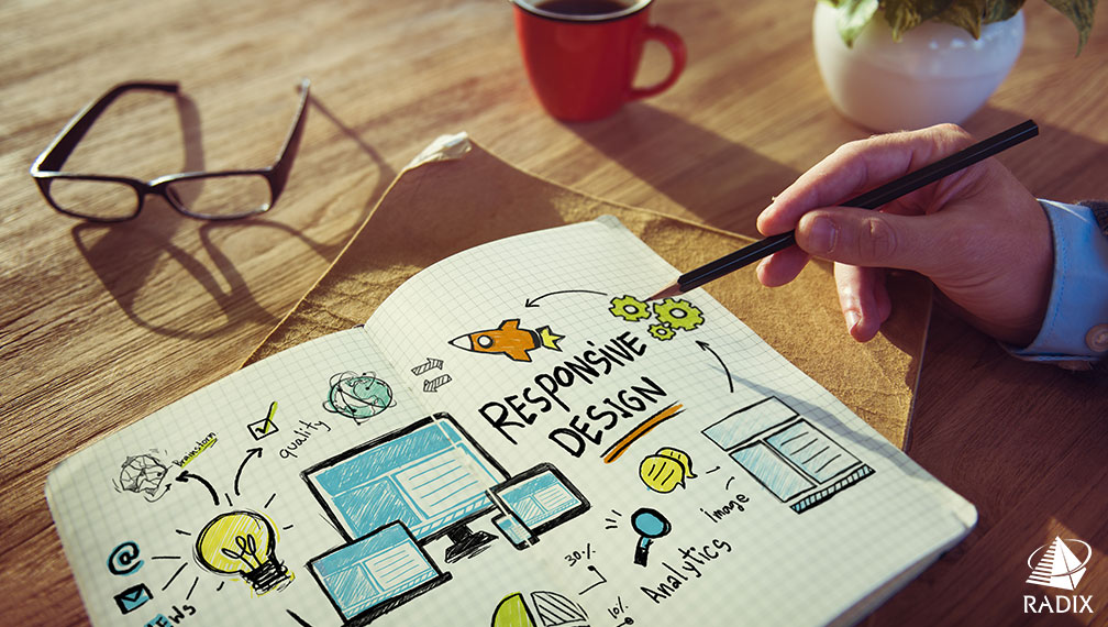
Over the past few years, in addition to desktop, we have many other options to use internet. We can access internet via laptops, tablets, and smartphones. Two years back enterprises had to design and develop separate websites for both desktop and mobile platforms mostly due to resolution issues. However, the innovation of Responsive Web Design (RWD) technique has allowed us to design single website that is compatible with different devices and browsers.
Our designers use responsive web design techniques to create advanced business centric websites for desktops, laptops, mobiles, and tablets. We create layouts that easily transform according to the screen resolution of a user’s device.
Our designers use HTML5 and CSS to develop responsive web designs. They provide single brand experience by designing one version of text, images, content management, etc for all platforms. You can hire responsive web designers from us to design an attractive, interactive, and dynamic website. Our responsive web design includes:
Flexible Content Management
Our responsive web design permits frequent content updation. You can update website content as per your changing business needs with less effort. Since our responsive web design provides one website for all devices, you need to modify the website only once.
Enhanced User Experience
Our responsive web design makes sure that your users get rich website experience and you get optimized performance. We offer easy to read layout design, smooth navigation, minimum clicks, and least possible scrolling. This rich user experience persists along different device platforms. Even recent updates show that Google has started promoting responsive websites along with desktop web applications.
User Friendly Website Design
You can hire responsive web designers from Radix to create web pages with high end features and functions. Our responsive websites effectively and successfully run on several devices with different screen size. The use of features and website navigation remains simple and smooth on different devices. This means you can attract a wider audience and customer base.
SEO Friendly Web Design
With smart SEO techniques, these days all search engines figure out a connection of mobile websites with desktop ones. You can optimize your mobile responsive website on desktop and on mobile. Our designers offer SEO friendly responsive web designs that can bring your site at the top of any search engine.
Less Maintenance Efforts
Since your one website runs across different platforms, you have to maintain only one website. Your maintenance efforts and costs get reduced here. You also do not have to spend a lot of time for maintenance.
Responsive Media Display
We can integrate various media toolkits in a responsive web design. Our designers can offer not only resizing of pictures and content but also insertion of media tools like videos, moving texts, etc. These media toolkits will also be responsive to different devices.
At Radix you can hire dedicated designers to create responsive web designs for:
- Corporate Websites
- Personal Websites
- E-commerce Websites
- Mobile Gaming Applications
- Social Networking Websites
- GPS Navigation Applications
- Entertainment Web Applications
Enjoy premium responsive web designing services from Radix. You can save cost for separate website designing for each platform or device.