Responsive Website Designing: The Leading Trend of 2014
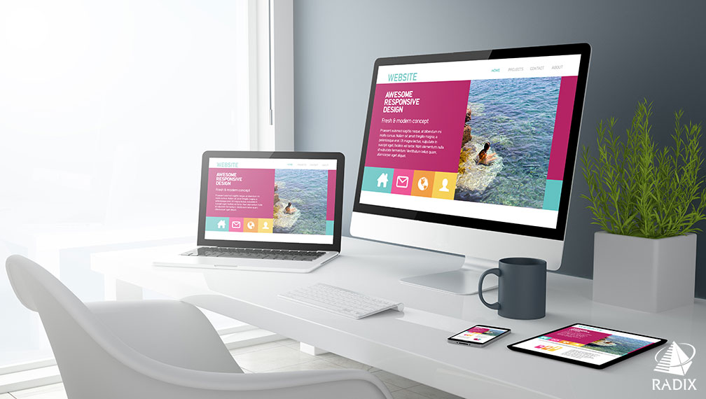
The ratio of people accessing internet through smartphone is increasing by leaps and bounds. With the emerging concept of responsive website designing, internet is available to smartphone users within no time. Due to the automated resizing facility of responsive technique, the same website is viewable at desktop, laptop, tablets and smartphones.
At Radix, team of responsive website designers create classy and catchy web designs that are compatible with all the different devices. To earn competitive advantages, business owners go for responsive website designing to expand their customer reach and earn more bucks. The advanced offerings from responsive website designing are:
Enhance Customer Base & Business
Business owners can expand their customer base by catching attention of different device users. This enhances customer base of an enterprise. A quickly accessible website helps end customers in making rapid buying decisions. Our experienced web designers go for an in-depth research of clients’ business, industry domain, mindset of target audience, etc. to design and deliver a solution centric responsive website.
Better User Experience
As the same website appears with different resolutions, it requires less time for designing deliver a memorable experience to the site visitors with incredible features and functionalities. It also offer brand consistency of your business by spreading similar online identity at the online platform. The website viewers have faster and smarter user experience to surf around the website.
SEO Friendly Designing
Responsive designing recommended by Google as it allows to use same URL, HTML, CSS, meta data, description across all the devices. This helps in rank optimization of website at the Google as the website is searched and viewed by maximum visitors. Also avoid the issue of content duplication as the same content is applicable for all device users.
Cross Browser Compatibility
Along with having excellent compatibility on different devices our responsive website is compatible with almost all the browsers such as Mozilla, Internet Explorer, Chrome, Safari, etc. No matter what is the browser, our responsive website display effectively with perfect designing.
Social Media Friendly
Having compatible with smartphones when the website is shred at social media platforms, smartphone users can immediately share and access the website URL. They are attracted by catchy and seamless look and feel of the website.
Cost Effectiveness
As single layout can be used at all the platforms, clients need to pay for one website instead of paying for separate website for each platform. Responsive website set with all the devices having outstanding resizing capabilities.
We offer Responsive designing using Fluid Grids, Layout Agnostic and Media Queries. Fluid Grids allows website to set in all types of environment with prompt resizing functionalities. Fluid images are easily resizable, draggable and droppable. The images are adaptable by all the devices. Using Media Queries, we allow website to adjust the content and design as per the changing resolution of website from small to large. Radix Responsive Website Designing services are:
- Responsive Website Designing Layout
- Personalized Website Layout
- Unique Graphics and Artworks Designing
- Database Driven Application Designing
- Quick Designing and Maintenance