Web Design Font Trends 2016 – A Way to Transform
Information Technology is an industry which evolves every day and comes up with new things which surprise many. With such fast-paced developments, the way information is displayed on web pages also evolve and that is when web design fonts come into the picture.
Web design font trends have changed over the years and have kept modifying as per requirement and popularity. To keep your business website updated acquiring and considering font is one of the main aspects. Adopting the trend and move makes a longevity for your business. This not only acquire and attract the visitors but certainly it will boost your website and make the visitor to stay for quite long time and convert them into buyers.
Not less but yes what you invest you’ll get out of it – ROI is assured because of ‘the smart the website’ – ‘the smart the purchasers will be.’ The font trends of 2016 reveal quite a complicated picture with a variety of fonts making their presence felt and some old fonts making a comeback. Let’s get familiar with the ongoing Web Design Font trends 2016 which is dominating the web…
Web Design Fonts in Vogue 2016
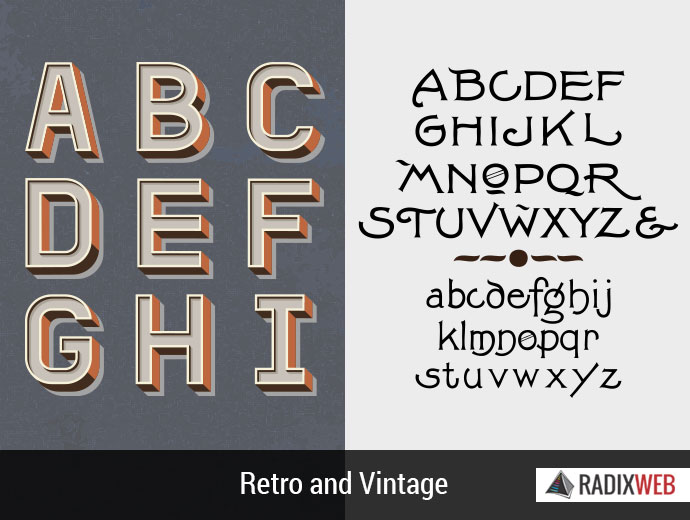
Retro and Vintage
Retro makes a wildcard entry in trend and the vintage is the latest new which is being used by most web designers. Although, it may not be the most suited for large scale print projects but for more energetic and eye soothing view it is preferable. The three basic subtypes of this web design fonts are (1) Brandon printed (2) Wanderlust (3) Monthoers
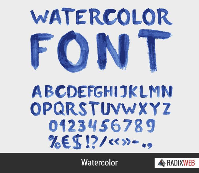
Watercolor Style
As the name suggests, it looks similar to watercolors on a canvas, painted by an artist. It looks special as it gives a handcrafted feel to the display. Since watercolors give different shades of the same color it can be challenging to use them but for those who are ready to take up the challenge, it can be fun to work with. The subtypes of this style are (1) Minty (2) Zubuqlione (3) Haze
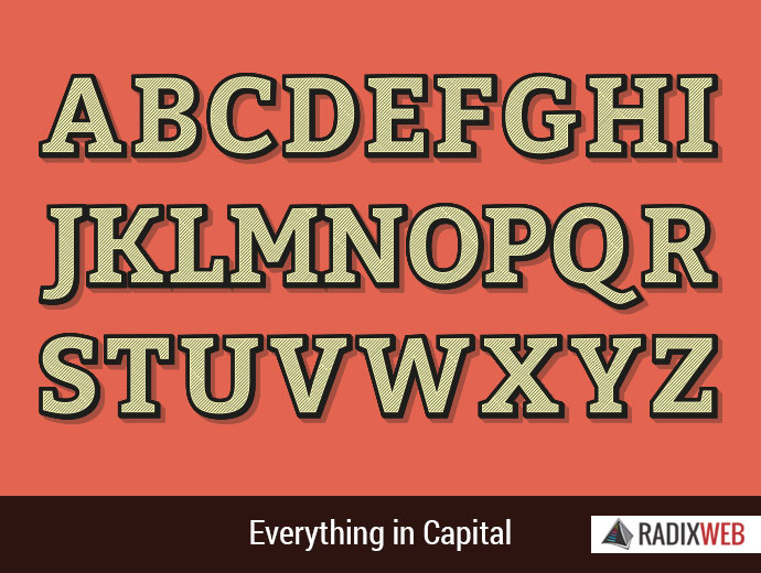
Everything in Capital Style
Generally, people dislike all capitals font as it is considered to be aimed at attracting the attention of the reader. It is more suited for use in navigation elements and display typography. However, it is advisable to use more spacing between words and opt for simple and easy to read words while using this font. The subtypes of this evergreen style are (1) Oswald (2) Sweet Sucker Punch (3) Prestiggio
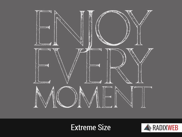
Extreme Size Style
In the following style, web designers use either too big or too small fonts which mingle with other screen elements. In this web design font style, there are trends within trends as web designers experiment with different combinations. Exactly opposite of this large font style is an extremely small font which is usually written in black and stands out as long as other screen elements don’t interfere.
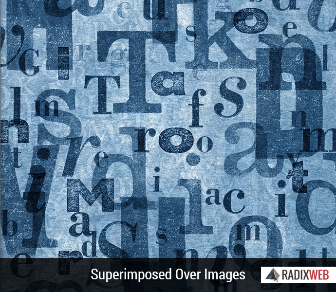
Superimposed Over Images Style
Words and images are no longer mutually exclusive on a web page and that is what web design font trends 2016 demonstrate. But this type of font requires designing to ensure that both image and text are visible and it is not affecting the other.
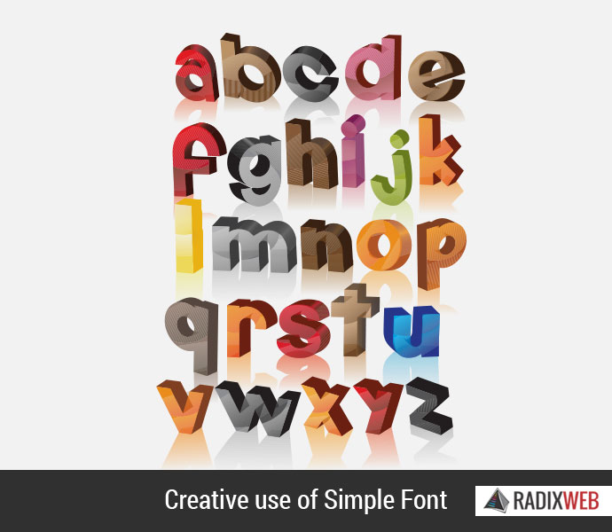
Creative Use of Simple Font Style
Earlier we talked about a text on images, now we talk about images on a text. The text which is used in this case has simple font style but is big enough to display a photograph. Again there is no hard and fast rule and web designer has the liberty to mix and match font styles to showcase his creativity.
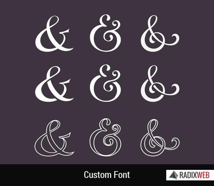
Custom Font Style
This is the best bet to set yourself apart from the rest. This font style is unique and is an amalgamation of various other fonts which is bound to attract attention. This font style is an image of the brand of the website and should be used sparingly. Ensure that it is compatible with different browsers and devices.
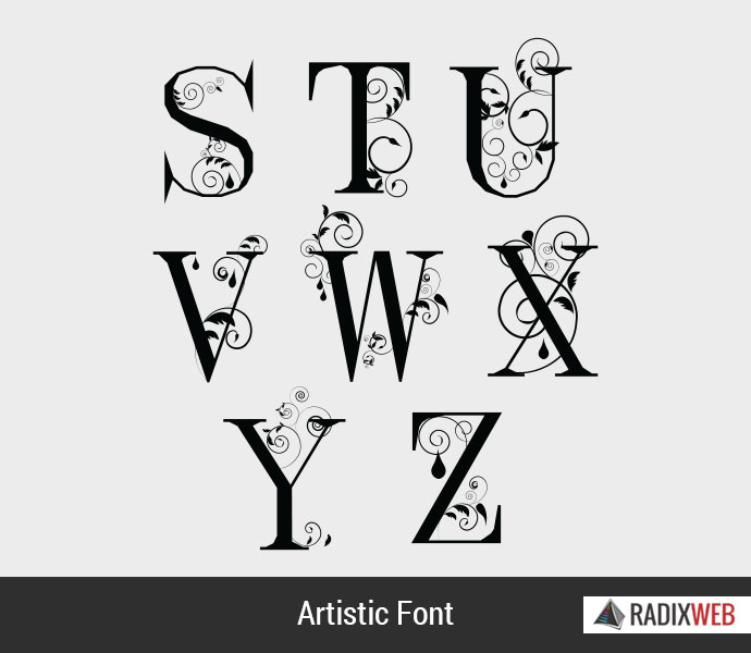
Artistic Font Style
This 2016 web design font style is meant for better looks than anything else and acts like a graphic element on the website. These fonts are solely designed for looks. The fonts work here as a graphic element in a Web layout than that of text. The drawback with this font style is that it is less legible and dilutes the meaning of the written word.
Web Design and Development @ Radixweb
At Radixweb we keep ourselves with the pace. Our skilled web designers keep themselves up-to-date with all the trends. Incorporating with the clients need we have developed many creative websites. If you are looking something Out of the Box then you just click away to Getting in. You can hire dedicated web designer and developers at Radixweb. Contact us today for more information.

